Understanding the psychology of colour enables you to choose appropriate colours for your business and marketing campaigns to ensure your promotional activity is effective and memorable. Colour is recognised as being an immediate identifier of the brand. Therefore picking the right colour is crucial, because it will appear in your logo, promotional material and product packaging.
The choice of colour in your marketing material can send either a positive or negative subconscious message, creating a good or bad perception of your business. According to Hallock’s findings* colours have different meanings in different countries. Therefore if you plan to do an international marketing campaign, you need to consider the personal preferences, experiences and cultural traditions of the recipient country. For example, in Asia the colour orange is seen as being life affirming and positive. However in the USA it is perceived negatively due to its association with traffic delays and fast food restaurants.
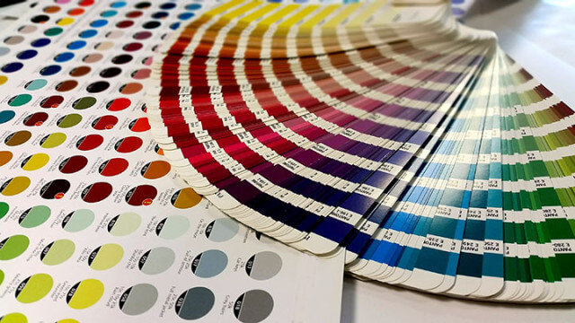
Which colour will work best for you?
Here are some of the perceptions we have of certain colours. Understanding our thoughts about a colour can help predict how your customers may react and therefore assist in selecting the right colour for your design.
 The colour red evokes strong emotions in any marketing campaign. Red is associated with passion, love, temper. Sometimes it is connected with danger. It is the most powerful colour for catching attention and has been used effectively for years to promote sales and products on offer.
 If you want to stand out from the crowd then orange is the colour to choose.It is seen as a positive colour and works best for marketing campaigns with youthful target. Peach tones are perceived as being quite calming and work perfectly for hospitals and beauty salons.
 Yellow is the happiest colour in the spectrum. Using it adds extra visibility to your campaign. Yellow conveys energy, playfulness and joy, making it perfect for summer campaigns and for promoting children activities. The darker shade of yellow – gold, is a symbol of luxury and aristocracy and usually creates security. It is often used to emphasize a name or logo in order to enhance the sophistication of the product.
 Green seems to be perceived as peaceful and the colour of the nature. It is also associated with reliability, safety, stability and freshness and works perfectly for companies who wish to convey these characteristics to its target audience.
 Not surprisingly, blue is the most popular colour among women and men*. It is a strong colour and is associated with calmness, trust, loyalty and power. Often blue is used by financial and medical institutions, but due to its popularity, it is quite common in industrial, transport and manufacturing sectors.
 Associations with luxury, royalty, mystery and elegance are inherent in purple. It is stylish and is commonly used by beauty salons, hotels and creative agencies. The shades of light purple to pink are perceived as calming, relaxing and romantic. Although, pink’s message varies in intensity of the colour, subconsciously it will always be associated with femininity.
 Brown is usually perceived as a relaxing natural colour. It’s earthy tone means it is associated with reliability and honesty. The shades from beige to brown are often used as trademarks for coffee and chocolate manufacturing industries.
 White is associated with purity, innocence and peace. Used either on its own or in a combination with any other contrast colour, you will not go wrong. It works perfectly to create the illusion of space.
The colour black is often used for luxury items due to its association with feelings of sophistication. It is also used by organisations that want to outline themselves as serious and trustworthy. The combination of the powerful classic colour black with either white, grey, silver or gold will definitely help you differentiate yourself from the competition in your marketing campaign.
 People associate grey with sophistication, elegance, traditionalism and neutrality. Different shades of grey and silver can be used in place of white or black in some designs as they often serve as a backdrop that can be commonly combined with stronger colours.
What does Raphael Design Team recommend?
Our advice would be to carefully align the colour of your marketing campaign with the nature of the products or services you offer. The right colour is a powerful tool, as it will help you to target the right audience thus ensuring the success of your marketing campaign. If you would like any further advice please give us a call on 01543 261220 or drop us an email.
*Joe Hallock, 2003, Colour Assignment
Should you wish to receive other useful tips about marketing, graphic design and print follow us or like our page.
Like us Follow us